Photographing Lake Reflections in Blue Hour
Composition is the most important part in landscape photography and much more than just rueles - it is the artistry concept of the photographer.
#1 The Rules of Landscape Photography Composition
There is only one rule in landscape photography or generally in photography: There are no rules.
Rules were built to make it easier for beginners to get out a bit better photos, without having to think about what the photo should say. Using rules is fantastic in the very beginning, but as soon as you want to improve your photography and you want to breath life into your photographs - try to get away from the common rules of photography. Try to understand how you are able to avoke emotions at the viewers.
#2 Balance
The balance is the difference of weight between the left and the right part of your photograph. Putting a symmetric element to the centre of a clean background, gives a balanced picture.

Putting the same element out of the centre, leads into an unbalanced photo.

To bring it into balance again, we need any other element at the other side - to balance the original element.

Size, saturation and luminance have an impact to the weight of an element. This is, why the following sample picture is quite well balanced, although the size of the elements is different:

But balance is often misunderstood. Goal is not to bring each photograph into balance. I see it more as a methode to convey mood and evoke emotions to the viewers, because the more an image is balanced, the more comfortable the viewer feels. The more it is unbalanced, the more unconfortableness is conveyed. This makes balance to a fantastic methode to get control over the viewer's emotion.
#3 Distracting Elements
The nature of distracting elements is, that they mislead the viewers eyes and destroy the flow through an image. High contrast and isolation make them even pop out. Are distracting elements at the edges of an image, they tend to lead the viewers eyes even out of the frame. This is exactly the opposite of that we want to achieve in most cases.
#4 Isolation
If elements are well isolated to each other, we convey a feeling of comfortableness. The more elements are overlapping each other, the more unconfortableness is conveyed. Also here is no right and wrong, there are no rules - as the most techniques in composition, it is just a possibility to get control over the emotions of the viewer.
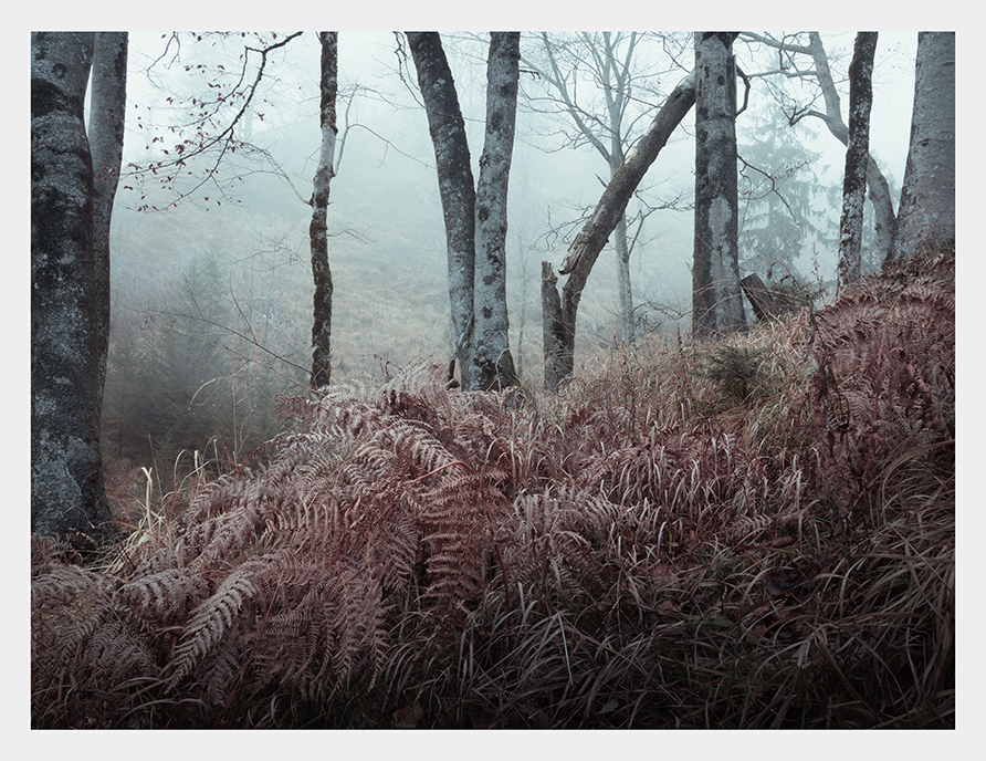
In woodland in most cases it is not 100 percent possible to avoid overlapping elements, because there are so many branches overlapping any other elements. Fog can help here massively to get the needed isolation.

Watch the whole video for more details and some additional composition tips: https://youtu.be/V2MHBc22zsg
Check out my gear, which I use for my landscape photography:
Nice greetings,
Christian
back to the overview


